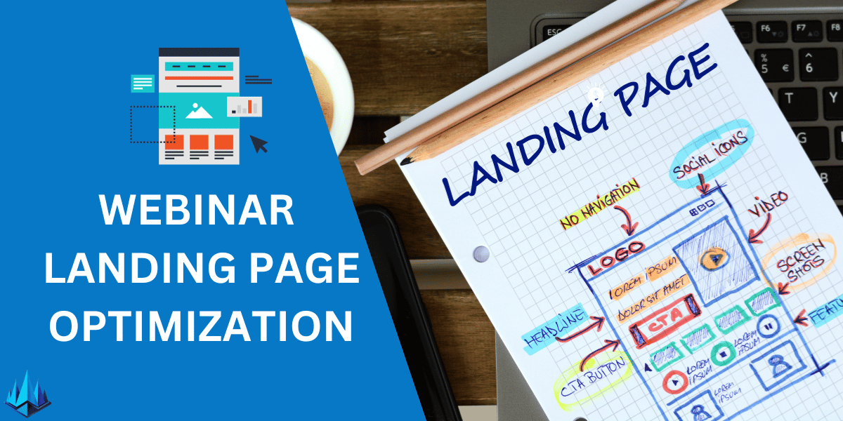
Are you struggling to get registrants for your webinars? You’re not alone. Many professionals find their webinar landing pages fall short in attracting and converting visitors.
A lackluster landing page means missing out on potential leads and valuable connections. It’s frustrating when you put effort into creating informative webinars only to have a few attendees due to ineffective landing pages.
Fear not! The key lies in understanding the secrets of high-converting webinar landing pages. This article unveils eight essential strategies for 2024 that will transform your webinar landing pages into powerful lead-generation tools.
- Recognize common pitfalls in webinar landing page design.
- Learn how to infuse your pages with elements that resonate with your audience.
- Discover the latest trends and techniques for 2024 to keep your webinar landing pages ahead of the curve.
- Understand how to measure and optimize for the best conversion rates.
How Can You Optimize Webinar Landing Pages?
1. Leverage Strong Headlines
Remember, your headline is the first thing visitors see. I found that using clear, benefit-driven headlines significantly boosts registrations. It’s crucial to communicate what attendees will gain from your webinar immediately. A/B testing different headlines can reveal what resonates best with your audience.
2. Utilize Engaging Visuals
Through personal trial and error, I’ve learned visuals are not just decorative but pivotal in engagement. Including relevant, high-quality images or short videos can increase interest. These visuals should complement your message, not distract from it.
3. Simplify the Registration Process
I’ve observed a direct correlation between simplified registration forms and increased sign-ups. Request only essential information. Each additional field can be a barrier to conversion. Tools like autofill can also enhance user experience and improve conversion rates.
4. Incorporate Social Proof
In my experience, social proof, such as testimonials or participant numbers, can significantly enhance trust. Highlighting positive feedback or notable attendee numbers encourages new registrants, as they feel more confident in the webinar’s value.
5. Optimize for Mobile
A lesson I’ve learned the hard way is the importance of mobile optimization. Many users will access your landing page via mobile devices. Ensure the page is responsive and loads quickly on various screens to avoid losing potential attendees.
6. Utilize SEO Best Practices
SEO is not just for blogs. I’ve found that incorporating relevant keywords, such as “webinar landing pages,” in titles, headers, and meta descriptions can improve visibility and attract organic traffic to your landing page.
7. Offer a Clear Value Proposition
One of my most effective strategies is articulating a clear value proposition. Clearly state what attendees will learn or how they’ll benefit. This clarity helps attract the right audience and increase registrations.
8. Implement Countdown Timers
Adding a countdown timer creates a sense of urgency. From my experience, this can motivate visitors to register sooner rather than later, leveraging the psychological principle of scarcity.
9. Conduct Regular A/B Testing
Lastly, continuous improvement is critical. Regular A/B testing on different landing page elements (like CTA buttons, color schemes, and layouts) can provide insights into what works best and keep your page performing optimally.
Why Optimize Webinar Landing Pages
When hosting the best webinar, the devil is often in the details, especially regarding your landing pages. Optimizing these pages is not just about aesthetics; it’s about creating a seamless, compelling journey for potential attendees.
In the ever-evolving digital landscape, where automated webinars are becoming increasingly popular, having a well-optimized landing page is crucial. It’s the first point of contact with your audience and sets the tone for their entire experience.
A poorly designed or non-optimized page can deter even the most interested individuals. On the other hand, a landing page that’s fine-tuned to your audience’s needs can significantly boost registrations, engagement, and, ultimately, the success of your webinar.
Remember, in automated webinars, where direct human interaction is limited, your landing page is your best ambassador. Optimizing it with precision is not just a recommendation; it’s necessary to stand out and deliver the best webinar experience.
Final Thoughts
Choosing the right free webinar software is just the beginning of crafting compelling webinars. Beyond the software lies the art of creating a captivating script and a well-structured funnel that guides your audience from awareness to action.
The writing is your roadmap, directing the flow and content of your presentation, ensuring that every word resonates with your audience.
Meanwhile, a strategically designed funnel is essential for nurturing and converting leads. It’s about creating a seamless experience that begins with the first click on your landing page and culminates in a successful webinar conclusion.
The synergy between a well-written script and an effective funnel can amplify the impact of your webinar, turning passive viewers into active participants and loyal followers.
Whether using free webinar software or premium tools, the real magic lies in how you script your story and design your funnel to create a memorable and impactful experience for your audience.
Frequently Asked Questions
What Are the Key Elements of an Effective Webinar Landing Page?
An effective webinar landing page should have a compelling headline, a clear value proposition, engaging visuals, concise and persuasive content, social proof like testimonials, a straightforward registration form, and a strong call-to-action (CTA). These elements capture attention, build trust, and encourage sign-ups.
How Can I Increase Conversion Rates on My Webinar Landing Pages?
To increase conversion rates, simplify the registration process, use A/B testing to optimize page elements, employ SEO strategies for better visibility, create urgency with countdown timers, and ensure your page is mobile-responsive. Personalizing content to resonate with your target audience also plays a crucial role.
Should Webinar Landing Pages Be Long or Short?
The length of a webinar landing page depends on your audience and the complexity of your webinar. Generally, a shorter page works well for straightforward topics, while more complex subjects might benefit from longer pages that provide detailed information. Understanding your audience’s preferences is key.
How Important Is Mobile Optimization for Webinar Landing Pages?
Mobile optimization is crucial for webinar landing pages. With many users accessing content via mobile devices, a mobile-responsive design ensures a seamless user experience, potentially increasing registration rates and broadening your audience reach.
Can Social Proof Really Impact Webinar Landing Page Performance?
Absolutely. Social proof, such as testimonials, user reviews, or attendee numbers, can significantly impact the performance of your webinar landing pages. It builds credibility and trust, influencing potential attendees’ decision-making by showing them the value others have gained from your webinars.

